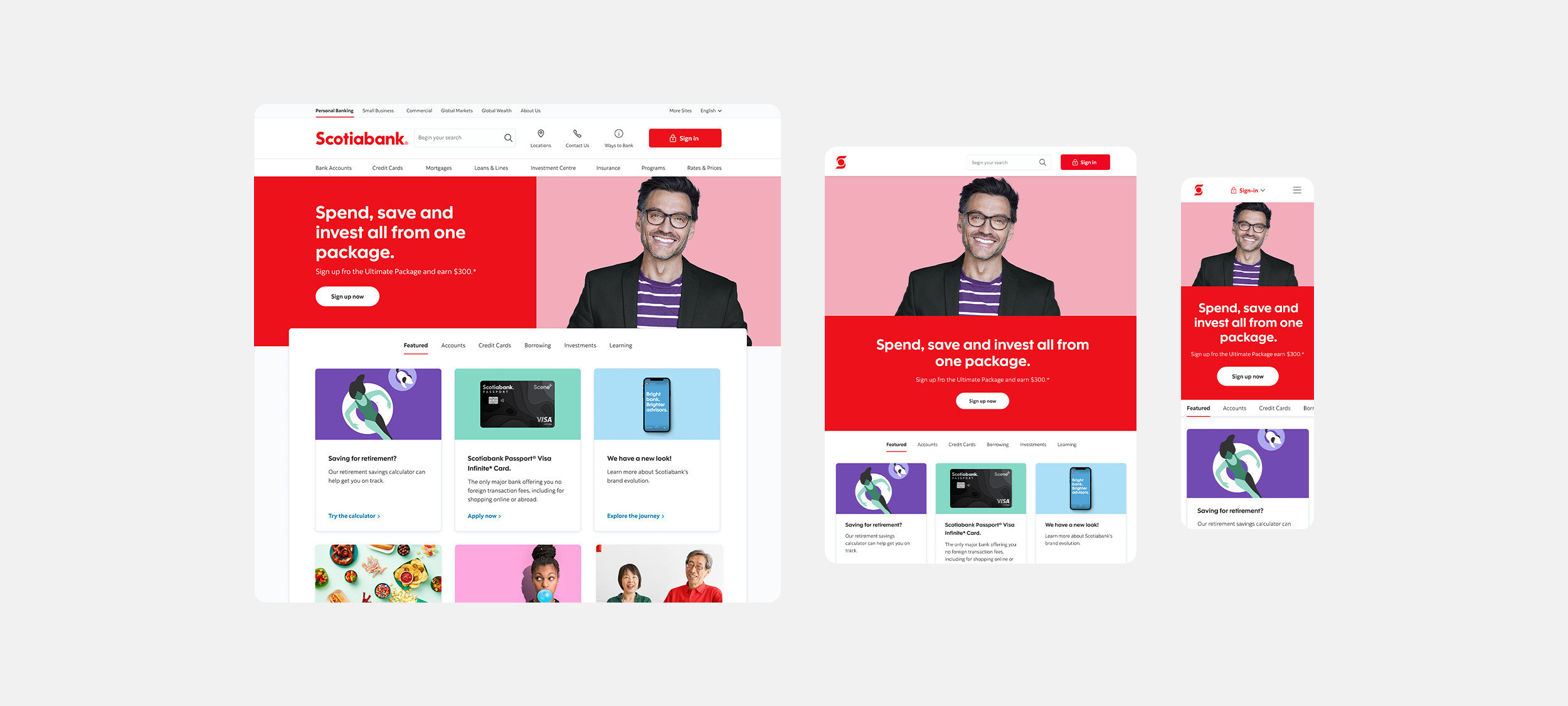
Scotiabank’s front door.
A bank’s website is its busiest branch. For most customers, the website, along with the mobile app, provides the first impression of the brand. Scotia’s most online views come from its homepage with over 61 million annual views.
The website is the gateway to transactions, focusing on retail, business banking, and wealth audiences. Digital banking was responsible for 26.7% of the bank’s sales in 2022. Needless to say, the redesign of the bank’s digital front door was a high-profile project to lead.
Scotiabank Homepage

The old state.
The previous site suffered from high bounce rates and low engagement. The visual design was not just outdated but failed to pass accessibility requirements.
Data-driven decisions.
The data clearly showed that the page had become little more than a home for the sign-in button. The vast majority of users were simply using this page as a gateway to online banking.
The multiple carousels saw weak engagement statistics as much of the content that was being created weekly for the homepage was going unseen.
UX solution.
My solution was to take the hidden content out of the carousel and display featured products in cards below.
Grouping these cards into categories allowed the page to showcase more products and users to make more informed navigational choices rather than being served up random content.
The ‘featured’ tab could also leverage data in Adobe Target to display personalized recommendations to unauthenticated users.
Initial refresh concept.
Scotiabank rebranded.
The refresh of the homepage coincided with a rebrand of the bank done by an outside agency. The in-production homepage would be the first property to showcase the new brand. In came geometric sans type, large colorful images with flat backgrounds, and a whole new illustration style and more.
This gave me an exciting opportunity to craft Scotiabank’s online adaptation of the new brand as the homepage set the tone for all digital design that came in the years prior.
Refined mobile menu.
The expanding menu (left) was a less than ideal in mobile. I implemented a much cleaner multi-level sliding menu with clear navigation to explore back and forth through categories.

The robust media card.
These new responsive cards brought order and clarity we were sorely lacking.
While originally created for the homepage, the media cards went on to be one of the most used elements across all our digital properties.
Many variations were created to support various content types and graphical elements.
A new hero.
Another popular component to come out of the redesign was the hero banner. Designed to be used with multiple combinations of , color, text, image, icon, illustration and videos - the hero banner was one of the first components to shape the bold new direction Scotia would take with the new brand.


